How to Create a Conversion-Focused Ecommerce Homepage
🎯 Why Your Ecommerce Homepage Matters
Your homepage isn’t just a pretty digital storefront; it’s the gateway to your sales funnel.
Visitors decide within 3-5 seconds whether to stay or leave. A conversion-focused homepage helps:
- Increase sales and reduce bounce rates
- Build trust instantly
- Guide visitors toward taking clear actions
Here’s a step-by-step, practical guide to transform your homepage into a high-converting machine.
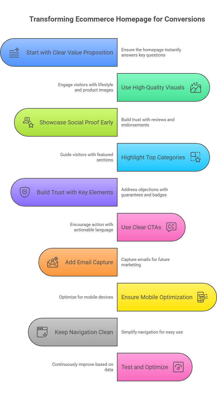
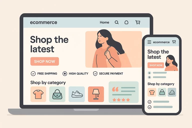
1️⃣ Start With a Clear Value Proposition Above the Fold
The above-the-fold section (the first screen without scrolling) should instantly answer:
-
What do you sell?
-
Who is it for?
-
Why should they care?
What to include:
- ✅ Headline: Benefit-driven, clear, and aligned with your brand (e.g., “Eco-Friendly Sneakers for Everyday Comfort”)
- ✅ Subheadline: Supporting sentence reinforcing the value (e.g., “Made with 100% recycled materials, designed to last.”)
- ✅ CTA Button: “Shop Now,” “Find Your Fit,” or a quiz.
- ✅ High-quality image: Lifestyle or product-focused visual.
Example:
Headline: “Skincare That Works While You Sleep.”
Subheadline: “Wake up to hydrated, glowing skin with our overnight serums.”
CTA: “Shop Bestsellers”
2️⃣ Use High-Quality, Purposeful Visuals
Visuals are the first emotional trigger for visitors. They should:
- ✅ Show your product in context (lifestyle photos > plain product images)
- ✅ Highlight key features or benefits visually
- ✅ Be optimized for mobile and fast loading
- ✅ Align with your brand aesthetics
3️⃣ Showcase Social Proof Early
Visitors trust other buyers more than your claims. Add:
- ✅ Customer reviews or star ratings
- ✅ UGC (User-Generated Content) photos
- ✅ Influencer or celebrity endorsements (if applicable)
- ✅ Press logos (“As Seen In…”)
Placement Tip: Place social proof above or just below the fold for maximum trust-building impact.
4️⃣ Highlight Top Categories or Featured Products
Visitors often don’t know where to start. Guide them with featured sections:
✅ “Best Sellers”
✅ “New Arrivals”
✅ “Summer Essentials”
✅ “Shop by Category”
Use clickable image blocks with clear labels to drive visitors deeper into your funnel.
5️⃣ Build Trust With Key Elements
Address potential objections and hesitations directly:
✅ Free shipping/returns (“Free shipping on orders over $50”)
✅ Secure payment badges (Visa, Mastercard, PayPal logos)
✅ Money-back guarantees
✅ Contact info or chat availability
Place these in a visible area (announcement bar, icons below hero, or footer).
6️⃣ Use Clear, Actionable CTAs Throughout
CTAs guide visitors on what to do next. Best practices:
✅ Use actionable, clear language: “Shop Now,” “Take the Quiz,” “Get 10% Off”
✅ Make CTAs stand out with color contrast
✅ Place CTAs after every major section, especially on mobile
7️⃣ Add Email Capture for Long-Term Conversions
Not all visitors will buy immediately. Capture their emails using:
✅ A pop-up offering a discount (“Get 10% off your first order”)
✅ A quiz (e.g., “Find the Perfect Skincare Routine”)
✅ Embedded email form mid-page or in the footer
This allows you to retarget them via email marketing to convert later.
8️⃣ Ensure Your Homepage is Mobile-Optimized
Over 70% of ecommerce traffic is mobile. Check:
✅ Fast loading speed
✅ Readable fonts and clickable buttons
✅ Easy-to-navigate menus
✅ Optimized images and video for mobile
Test your homepage on multiple devices to ensure a seamless experience.
9️⃣ Keep Navigation Clean and Intuitive
Cluttered navigation confuses visitors.
✅ Keep the menu simple: Home, Shop, About, Contact, Cart
✅ Highlight your best categories in the menu
✅ Add a visible search bar for quick product discovery
10️⃣ Test, Measure, and Optimize Continuously
Building a conversion-focused homepage is an ongoing process.
✅ Use heatmaps (Hotjar, Clarity) to see user behavior.
✅ Track:
-
Bounce rates
-
Average session duration
-
Scroll depth
-
Click-through rates on CTAs
✅ Run A/B tests on:
-
Hero images and copy
-
CTA placements
-
Social proof sections
Optimize based on data, not assumptions.
✅ Summary Checklist for Your Homepage
- Clear, benefit-driven headline and subheadline
- High-quality visuals with lifestyle context
- Visible social proof and trust elements
- Featured categories/products for easy navigation
- Strong, clear CTAs
- Email capture opportunities
- Fully mobile-optimized
- Clean navigation
- Fast loading speeds
- Ongoing testing and optimization
🚀 Final Thoughts
Your ecommerce homepage isn’t just a welcome mat—it’s your first sales conversation with a potential customer.
By designing it with clear CTAs, social proof, trust elements, and mobile-first speed, you reduce bounce rates and increase conversions systematically.
Don’t aim for just “beautiful.” Aim for a homepage that sells.